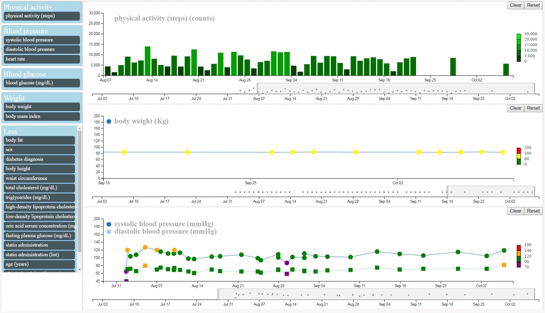
CARRE provides web-based components for interactive health data visualization and risk analysis, including dashboard for health information summary, Healthlines for fitness and biomarker data, and interactive risk evaluation diagram for risk monitoring and analysis.
Fitness and medical measurement data are inherently time dependent. To visualise time-varying data, a linear form timeline is a natural choice and has been used by many of the previous works. To visualise multiple variables, the CARRE Healthlines, a special form of timeline group, is used to visualise multiple variables of fitness sensors and biomedical markers. Data trends can be observed and data correlations may be discovered by comparison of the data curves of the multiple variables. As the data records may cover a long period, interactive techniques such as zooming and overview of details are employed. The users can also select the interested variables from the variable list by drag-and-drop.
The technique of parallel coordinates is an approach for visualising multiple quantitative variables using multiple axes which are placed parallel to each other in the most common case. The advantage of parallel coordinates is that it supports visualisation of multiple variables and correlation between attributes can be discovered by certain visualisation patterns. It is a common technique of visualising high-dimensional data and analyzing multivariate data. In CARRE there are a number of fitness and biomarker variables and both patients and medical practitioners like to view or study correlations among different variables. Consequently, parallel coordinates is chosen for multi-variable correlation visualisation analysis of fitness and biomarker data.


